

UI Trends in 2023
The three trends that stood out in interface design in 2023.
Interface Design is a niche that, like User Experience Design, is closely tied to the movements and advancements in the technology market, sometimes even dictating changes in software development.
As companies find new business opportunities in their demands, innovative solutions or those that were previously discarded start to be considered and appreciated for their results. This gives rise to trends that can quickly be found in portfolios of digital products.
By exploring these portfolios and looking at the technology projects led by Espresso Labs in 2023, we will discuss in this article the trends that have stood out so far:
MOTION DESIGN
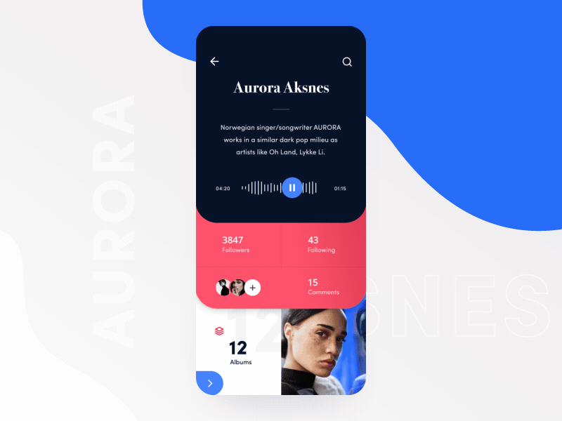
music app concept
by Taras Migulko
Motion Design is a visual communication language that works with animation and/or movement of visual resources to enhance the project with a dynamic narrative and evoke sensations or environments that interact with the end user.
In interface projects, video compression and animations without loss of quality have enabled dynamic screens that do not compromise usability. They use motion design to interact with users, evoke emotions, and make use of the timing of the narrative built throughout the application or system journey.
There are various types of motion design techniques that can be employed to create engaging and dynamic interfaces. One common approach is microinteractions, which are subtle animations or transitions triggered by user actions, providing feedback and guiding them through the app's functionalities.
SCROLLYTELLING
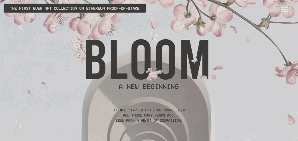
scrollytelling example
by Bloom.xyz
There are various types of motion design techniques that can be employed to create engaging and dynamic interfaces. One common approach is microinteractions, which are subtle animations or transitions triggered by user actions, providing feedback and guiding them through the app’s functionalities.
This is an excellent alternative for solutions that need to accommodate a large amount of information that may result in visual clutter, as it ensures that they are not in contact with the user simultaneously.
Another approach is the use of parallax scrolling, where different elements move at varying speeds, adding depth and visual appeal. Scrollytelling in apps provides a dynamic and interactive storytelling experience, allowing users to explore and engage with information in a more intuitive and engaging manner.
CHEERFUL COLORS
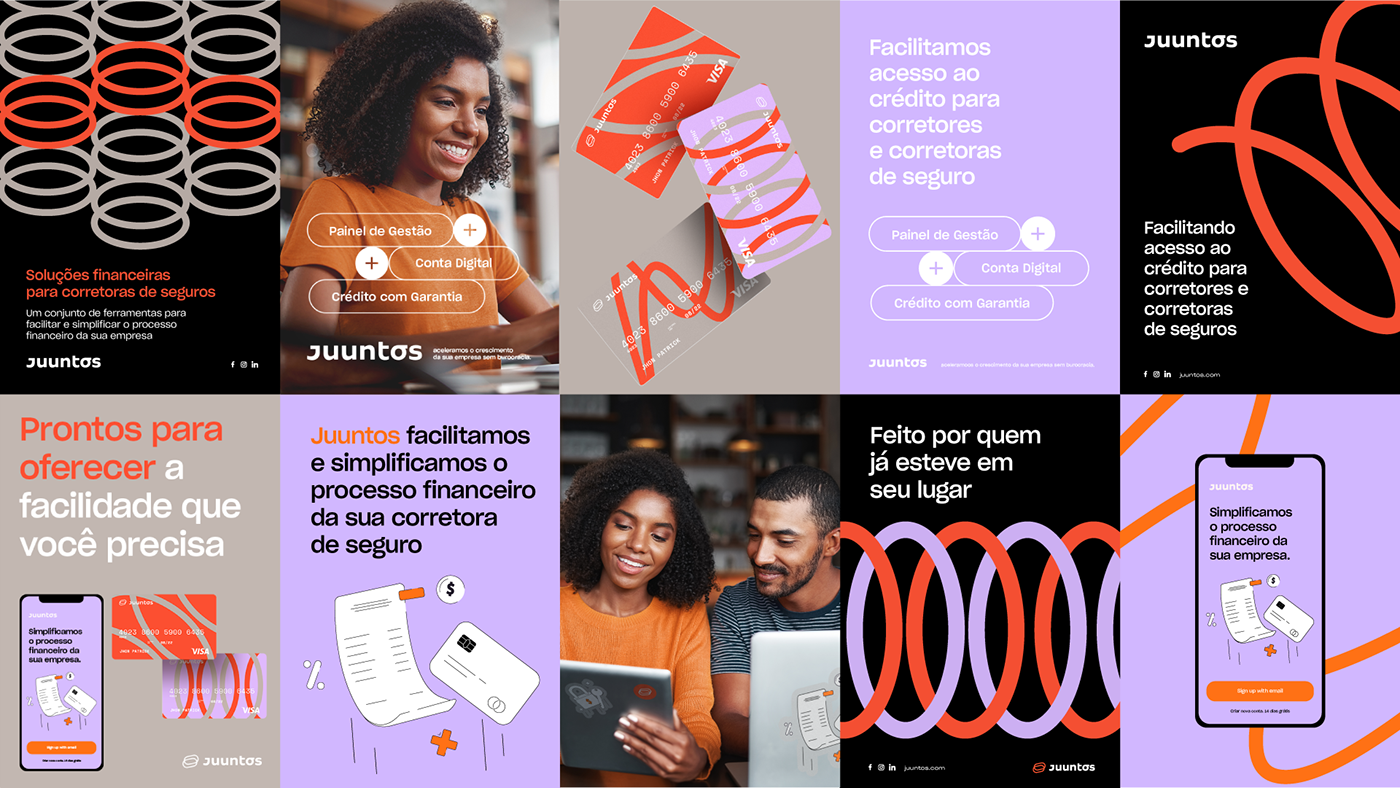
Example: Juuntos branding
by Abduzeedo
A constant element we have seen in the identity of digital products is the contrast of saturated colors in harmony with pastel tones or colors that allow the use of vibrant hues in the color palette.
The intention behind this combination, in most solutions, is to provide a relaxed environment that incorporates elements of plainness, crudity and transparency that can often be interpreted as austere and menacing. Although it may generate some information overload, specially when bucks the rules of conventional design in favor of challenging, experimental layouts and goes against minimalism, the correct use of attention-grabbing static assets creates dynamism and a false sense of interaction.
By incorporating vibrant and saturated hues, startups can convey a sense of energy, enthusiasm, and positivity. These colors help to create an engaging and lively visual experience for users, making the startup's digital products also stand out from competitors.
Can you imagine your digital product fitting into any of these trends?
Our services and methodology are always ready to help you understand how aesthetic solutions like these can add value to your business. We would love to hear more about your technology project. Please get in touch!


