The Origin of Espresso’s Mascot: Meet Presso
About seven years ago, a simple joke turned Espresso’s old logo into a small character. Espressinho appeared, found its way into internal conversations, and eventually became part of the company’s story. Now, that story enters a new chapter: inspired by the original character, Presso is here to accompany Espresso into a new phase.
In Japanese culture, mascots are part of the everyday life and identity of cities, regions, and institutions. They help represent local characteristics in a charismatic, approachable, and memorable way. One well-known example is Kumamon, the mascot of Kumamoto Prefecture, who has become recognized far beyond the region.
Inspired by this tradition, and also by Edu — CEO and one of Espresso Labs’ founders — and his close connection to Japanese culture and community, the idea of creating a mascot for Espresso began to take shape. But the story started in a much more spontaneous way than planned.
Before Presso, There Was Espressinho
[caption id="attachment_74859" align="aligncenter" width="425"] Illustration of Espressinho, Espresso's first "mascot."[/caption]
About seven years ago, during a joke between Edu and João Matumoto, now a Product Manager at Devint, Espresso’s old logo was given eyes, a mouth, legs, and a cap. That was how Espressinho was born. The idea was not part of a visual identity project or a brand strategy. It was simply a joke. But that little character stood the test of time and gradually earned a special place within the company.
During the pandemic, Espressinho began appearing as stickers in internal communication channels and on some internal announcements. Little by little, that improvised drawing became part of Espresso’s everyday life, even though it had never been created with that intention. It was precisely this story that made Espressinho the main reference for the next chapter of our mascot.
From Espressinho to Presso
[caption id="attachment_74860" align="aligncenter" width="526"]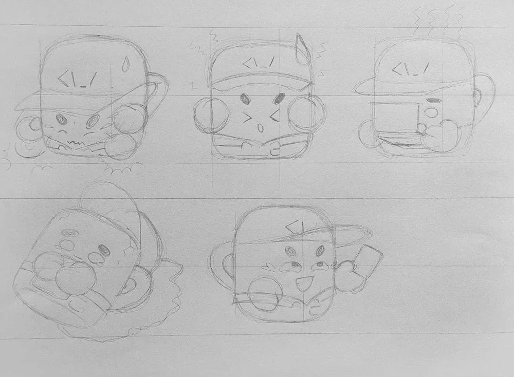 Sketches of the new mascot.[/caption]
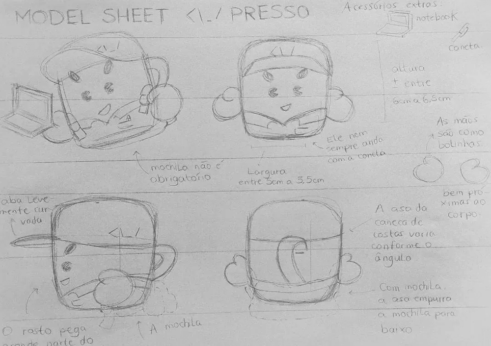
In 2026, we had the opportunity to evolve that idea. The goal was to preserve the essence of a character that was already part of Espresso’s history, while giving it an even friendlier, more expressive look that could better represent the brand.
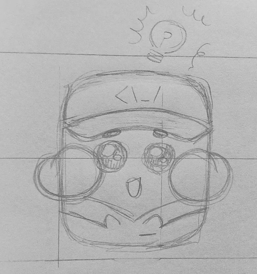
That was how Presso was born.
[caption id="attachment_74862" align="aligncenter" width="358"] Presso, the Espresso Labs mascot.[/caption]
The new character draws inspiration from the original Espressinho while developing an identity of its own. Its name also reflects this close relationship with the brand: Presso is simply a nickname for Espresso. There is also an important choice behind this new version: the character was created by illustrator Cleber Akira, without the use of artificial intelligence. We wanted this evolution to carry the perspective and interpretation of a person.
A Character to Grow with Espresso
Presso is not here to replace Espresso’s visual identity. He is here to complement it. He will mainly be part of our internal communications and employee engagement initiatives, appearing in places such as our monthly newsletter, where we share news, updates, behind-the-scenes stories, and curiosities about our teams.
[caption id="attachment_74867" align="aligncenter" width="734"]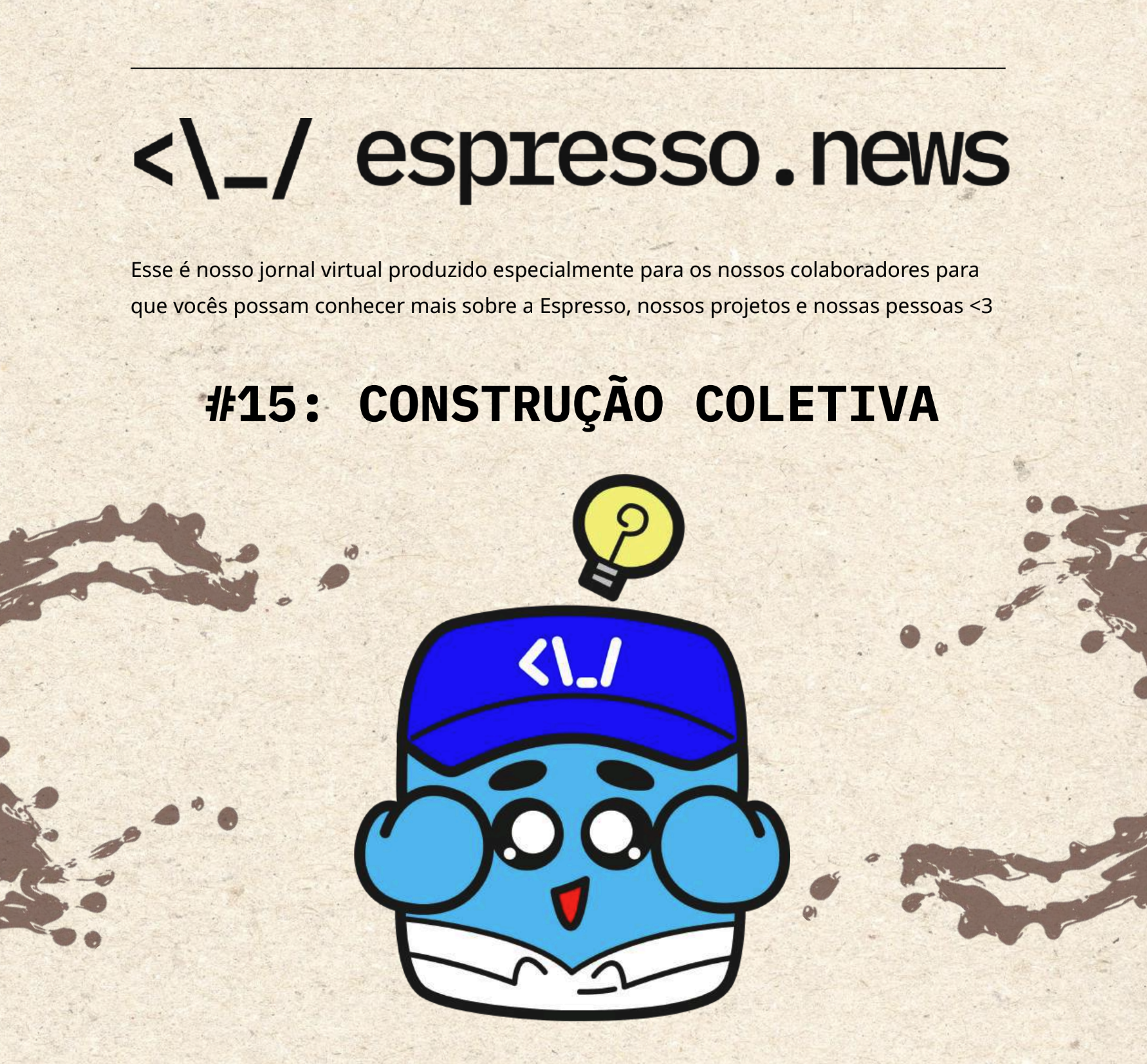 Cover of our newsletter where the mascot appears for the first time.[/caption]
The idea is for Presso to become part of Espresso’s communication in a lighter and more approachable way. He can show up to share an update, illustrate a situation, or simply become part of the stories happening around the company.
More than a new visual element, Presso carries a story that began about seven years ago, with a joke between two people, and gradually took on new meanings over time.
Now, that story takes on a new form, and Presso will be part of Espresso’s journey from here on.