The cultural impact on interface design: what I learned browsing Japanese websites
An opinion piece by Eduardo Missaka, CEO of Espresso Labs. A trip to Japan and the shock of browsing Japanese websites became a reflection on how culture shapes interface design, and why there is no single right way to design good digital experiences.
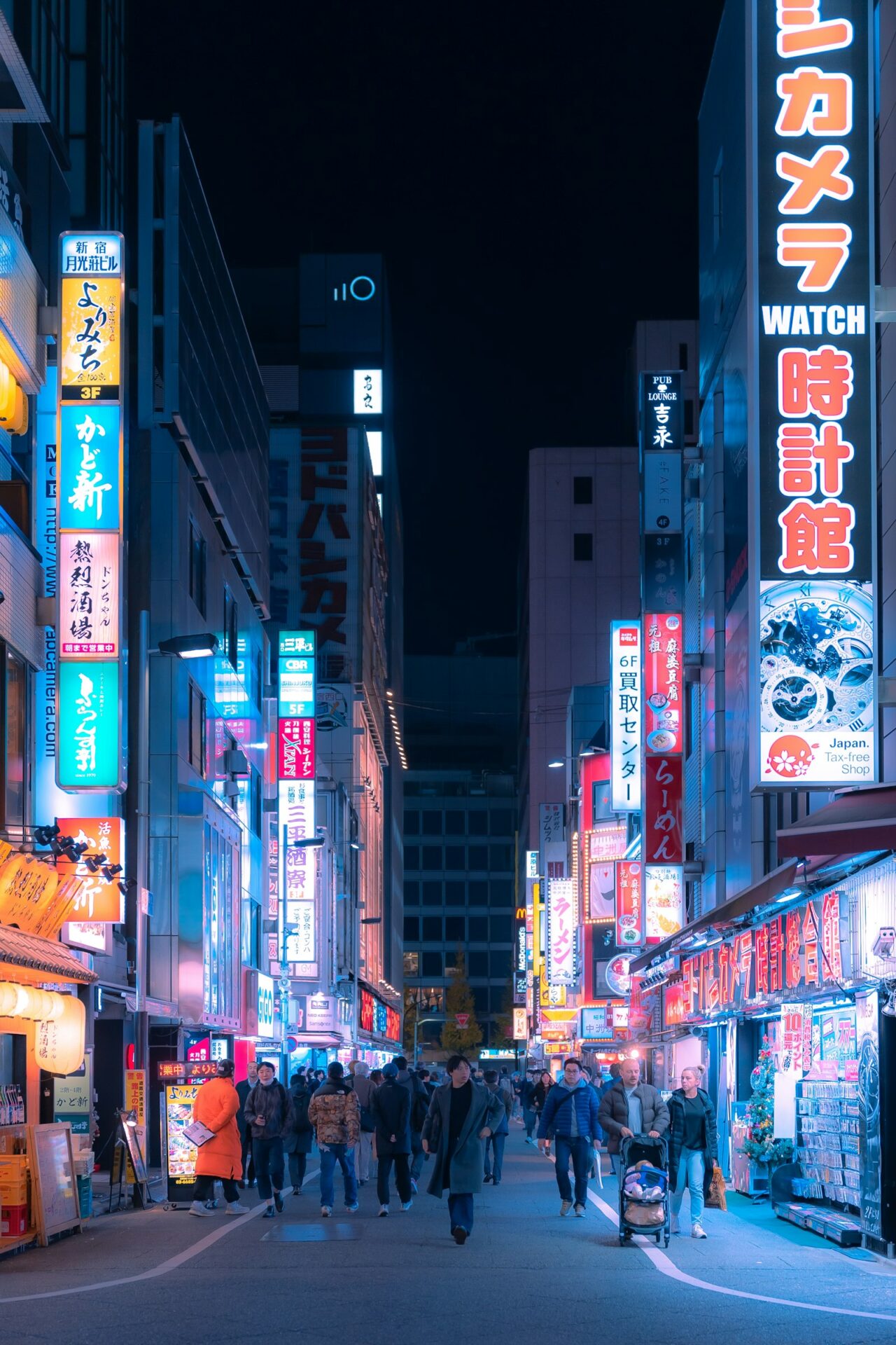
An opinion piece by Eduardo Missaka, CEO of Espresso Labs.
I visited Japan recently and, among the many impressions of the trip, one stayed with me from the first day to the last: the experience of browsing the Japanese internet. Booking a restaurant, buying a train ticket, checking a store's website. Every trivial task put me in front of pages that, to my Brazilian eyes accustomed to minimalist interfaces, looked like they came from another era: dense, packed with text, banners, notices, tables and colorful stamps competing for every pixel of the screen.
My first reaction was the obvious one: "these websites are bad". It only took paying attention to how the people around me used those same websites, fluently and without any friction, for the question to change from "why is this so bad?" to "what am I not understanding here?". This article is an attempt to answer that second question, which says a lot about how we think about interface design at Espresso Labs.
The difference is real, and it is not a lack of skill
First, let's set aside the lazy explanation. Japan does not design dense pages out of technical backwardness. We are talking about one of the most technological countries in the world, which had popular mobile internet with i-mode years before the smartphone existed, and which is home to some of the most respected design studios on the planet.
The density of Japanese websites is a choice, sustained by a set of mutually reinforcing factors. Writing is one of them: Japanese combines three systems (kanji, hiragana and katakana), and kanji carry a lot of information in very little space. A block of text that would take three lines in English fits in one, and the trained eye scans it naturally. Add to that the history of the Japanese mobile web, born on tiny screens filled with links, the influence of print media (newspapers, magazines and the chirashi flyers, dense by definition) and the habit of comparing offers in detail before buying.
Risk aversion: inform as much as possible so the customer can decide safely
The most interesting factor, though, is cultural. Japan has a culture marked by risk aversion and by the search for certainty before a decision. Classic comparative culture studies, such as Geert Hofstede's, place the country among the highest in the world in "uncertainty avoidance", and that shows up in design.
If the Japanese customer wants to be absolutely sure before deciding, the website needs to inform as much as possible: complete specifications, detailed conditions, price tables, notices, seals, frequently asked questions, all visible, preferably before the click. Hiding information behind a clean menu, as western minimalism does, is not elegance in that context. It is omission. The information overload that looks chaotic to us serves a precise function: reducing the uncertainty of the person deciding.
Overload is not clutter, it is reassurance
This is the point that inverted my reading. What I saw as clutter, the Japanese user sees as reassurance. A dense page says: "this company has nothing to hide, everything is here". A minimalist website, with one beautiful photo and one button, can trigger in the Japanese user the same suspicion a one-page contract would trigger in a lawyer: where is the rest?
Density signals seriousness, effort and transparency. And the reverse also holds: the average Brazilian, in front of a typical Japanese website, feels discomfort and distrust, because our repertoire associates visual clutter with amateurism. Both users are right. Each one is reading the interface with the cultural dictionary they own.
There is no optimal interface, there is an adequate interface
The conclusion I brought home is simple to state and hard to practice: understanding the target audience is essential to designing interfaces and experiences, and we cannot fall for the myth that there is one right or "optimal" way to design digital experiences.
The best practices we treat as universal (minimalism, white space, lean hierarchy, few options per screen) are, to a large extent, conventions of a specific culture at a specific moment. They work very well for certain audiences and contexts, which is why we apply them every day. But they do not replace the question that should open any project: who is going to use this, with what repertoire, with what fears and with what expectations?
In our day-to-day work as a software house, that question comes up all the time, even without crossing oceans. The app for a rural producer cannot be designed like the app for a financial market trader. The internal system used by a factory team calls for a different information density than the same company's institutional website. A 60-year-old audience and a 20-year-old audience read the same screen in different ways. Culture is not only nationality: it is industry, generation, context of use.
Interface design is not the art of applying trends. It is the discipline of making visual decisions based on a deep understanding of who is on the other side of the screen. Japan reminded me of that in the most vivid way possible: browsing, half lost, through websites that work perfectly. They just were not made for me.
Design driven by your audience
We design interfaces and experiences from the real context of the people who will use them, not from ready-made formulas.