High-end digital experience: what high-ticket companies have in common
In the luxury and high-value (high-ticket) market, digital experience does not accompany the product: it is part of it. When the ticket is high, customers judge a brand by its interface and user experience (UX) before speaking to anyone. That is why platforms for such different services and products end up sharing practices and patterns in design, voice, and service.
Minimalist interface: empty space is part of the product
Open a luxury brand's website and the first thing you notice is what isn't there. Few elements, plenty of white space, and a hierarchy that makes it clear what to look at first. This isn't design thrift. It is a positioning choice. [caption id="attachment_75184" align="aligncenter" width="720"]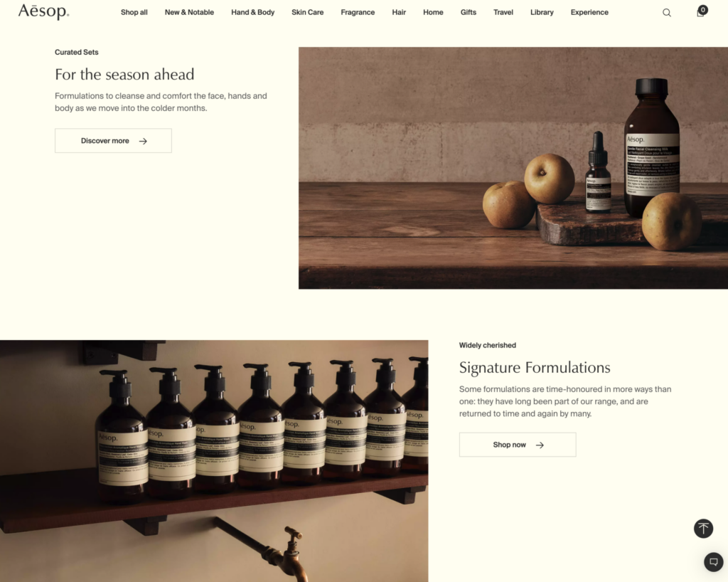 Bottega Veneta homepage: a lean menu and photography front and center. Reproduction.[/caption]
An interface packed with banners, badges, and promotions signals urgency and volume. An interface with room to breathe signals confidence: the brand doesn't need to shout to be noticed. What an interface chooses not to show also communicates value.
In digital luxury, the logic applies to how things work (UX), not just how they look (UI). Fewer options per screen, fewer steps to a decision, and less text explaining the obvious. On high-end platforms, every element has to justify its place.
Bottega Veneta homepage: a lean menu and photography front and center. Reproduction.[/caption]
An interface packed with banners, badges, and promotions signals urgency and volume. An interface with room to breathe signals confidence: the brand doesn't need to shout to be noticed. What an interface chooses not to show also communicates value.
In digital luxury, the logic applies to how things work (UX), not just how they look (UI). Fewer options per screen, fewer steps to a decision, and less text explaining the obvious. On high-end platforms, every element has to justify its place.
Consistent branding: the brand speaks before the words
In high-end brands, identity works as a system. Typography, color palette, photography, scroll rhythm, tone of voice: it all comes from the same place. In many cases, you can recognize the brand without seeing the logo and without reading a single sentence. [caption id="attachment_75182" align="aligncenter" width="720"]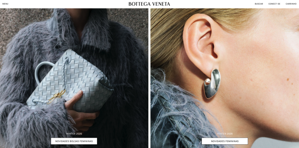 Aesop: typography, palette, and photography share the same atmosphere across sections. Reproduction.[/caption]
The hardest part is keeping that up across every touchpoint. The website, the app, the confirmation email, the support message, and the packaging need to look like they were made by the same person. Consistency is what turns aesthetics into trust. Anyone paying "a lot" expects nothing to feel out of place, and a generic button or an automated message in a different tone breaks the whole rhythm of the experience.
That includes the personality of the voice. Microcopy, such as an error message, an order confirmation, or a status notice, is also the brand speaking. On high-end platforms, it gets the same care as a campaign headline.
Aesop: typography, palette, and photography share the same atmosphere across sections. Reproduction.[/caption]
The hardest part is keeping that up across every touchpoint. The website, the app, the confirmation email, the support message, and the packaging need to look like they were made by the same person. Consistency is what turns aesthetics into trust. Anyone paying "a lot" expects nothing to feel out of place, and a generic button or an automated message in a different tone breaks the whole rhythm of the experience.
That includes the personality of the voice. Microcopy, such as an error message, an order confirmation, or a status notice, is also the brand speaking. On high-end platforms, it gets the same care as a campaign headline.
Authority positioning: the brand solves a desire, not just explains what it does
Many brands present themselves through a list of what they deliver: features, specifications, price comparisons. High-end brands tend to start somewhere else: what the customer wants to live, protect, or achieve. The product appears as the path to get there. [caption id="attachment_75181" align="aligncenter" width="320"]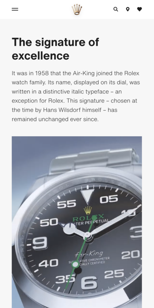 Rolex (mobile): the page tells the story of the Air-King signature instead of listing specifications. Reproduction.[/caption]
Think about the difference between describing how an object works and talking about what it means to the person who uses it. The first informs. The second positions the brand as someone who understands the customer's desire before they finish putting it into words.
That stance shows in the tone. An authority brand speaks with confidence, without over-justifying, without comparing itself to competitors, and without pressure. It doesn't need to convince: it needs to show it knows. In the interface, this translates into short texts, clear promises, and no artificial urgency.
Rolex (mobile): the page tells the story of the Air-King signature instead of listing specifications. Reproduction.[/caption]
Think about the difference between describing how an object works and talking about what it means to the person who uses it. The first informs. The second positions the brand as someone who understands the customer's desire before they finish putting it into words.
That stance shows in the tone. An authority brand speaks with confidence, without over-justifying, without comparing itself to competitors, and without pressure. It doesn't need to convince: it needs to show it knows. In the interface, this translates into short texts, clear promises, and no artificial urgency.
Customer experience: feeling important is part of the service
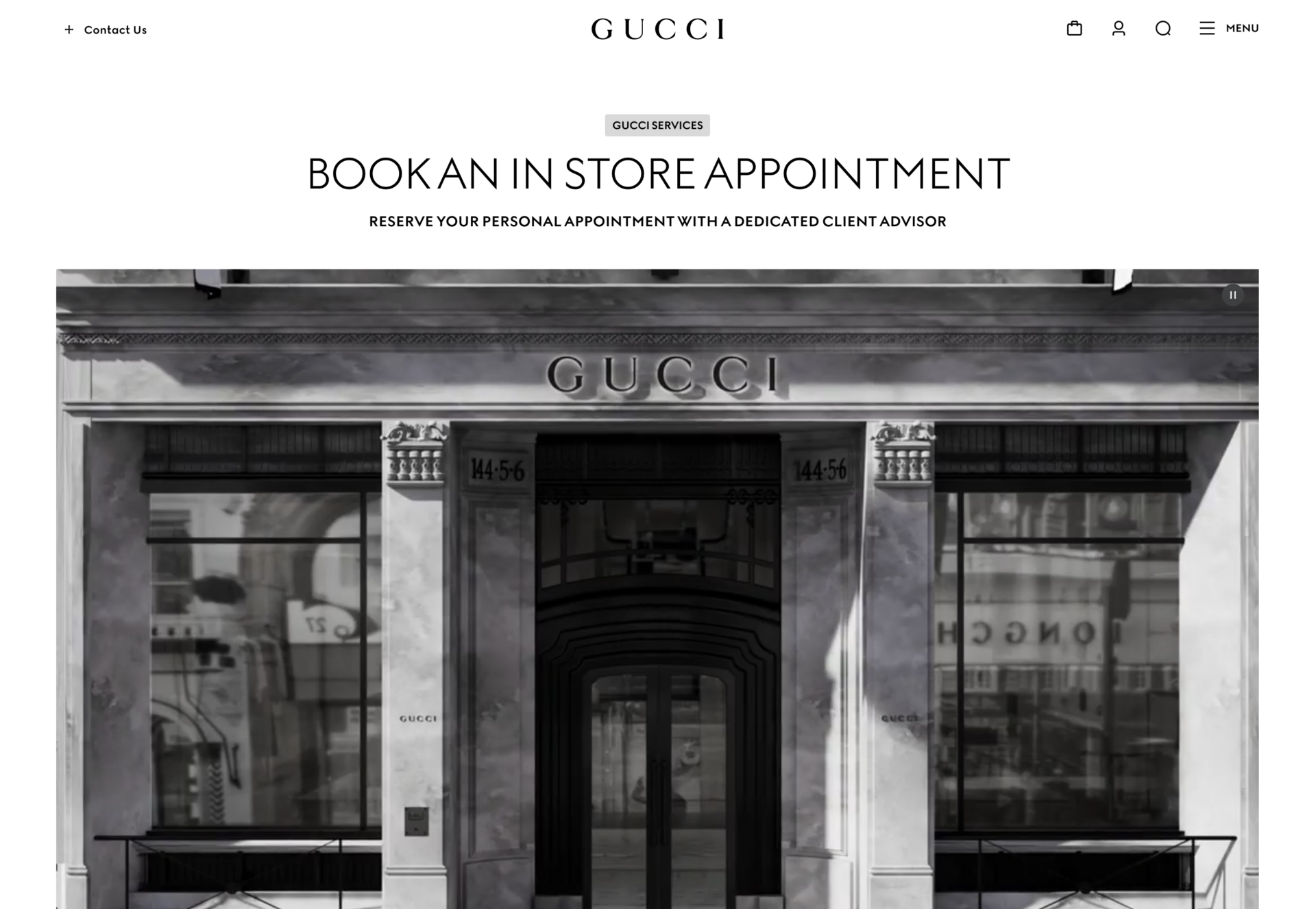
On high-end platforms, service is not a step after the purchase. It starts on the first screen. The customer experience (CX) is designed so customers feel recognized, well treated, and like the only person who matters in that moment. [caption id="attachment_75183" align="aligncenter" width="720"]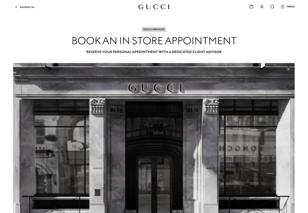 Gucci: booking an in-store appointment with a dedicated client advisor. Reproduction.[/caption]
In practice, it shows in the details. The platform remembers preferences and history, doesn't ask for the same information twice, and anticipates the next need. When customers want to talk to someone, a human channel is within reach, with a person who already knows the context.
Digital, in this case, doesn't replace human attention: it prepares it. Technology handles what is repetitive so people can handle what is personal.
There is a delicate balance. Too much personalization can feel invasive, and too much automation can feel like a support queue. The right point is where customers perceive care, not tracking.
Gucci: booking an in-store appointment with a dedicated client advisor. Reproduction.[/caption]
In practice, it shows in the details. The platform remembers preferences and history, doesn't ask for the same information twice, and anticipates the next need. When customers want to talk to someone, a human channel is within reach, with a person who already knows the context.
Digital, in this case, doesn't replace human attention: it prepares it. Technology handles what is repetitive so people can handle what is personal.
There is a delicate balance. Too much personalization can feel invasive, and too much automation can feel like a support queue. The right point is where customers perceive care, not tracking.
Time, ritual, and trust live in the details of the interface
When the amount involved is high, so is the fear of making a mistake. That is why the interface works, throughout the whole customer journey, to reduce anxiety: clear steps, visible status, no pricing surprises, and confirmations that explain what happens next. [caption id="attachment_75185" align="aligncenter" width="320"]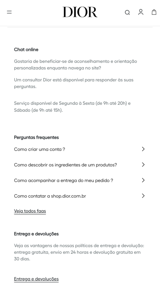 Dior (mobile): advisor chat, frequently asked questions, and delivery and returns policy on the same screen. Reproduction.[/caption]
Rhythm matters. Smooth transitions, short loading times, and discreet microinteractions make the platform feel careful, not just fast. Speed solves the customer's problem. Care makes them trust you. Security enters the same equation.
Dior (mobile): advisor chat, frequently asked questions, and delivery and returns policy on the same screen. Reproduction.[/caption]
Rhythm matters. Smooth transitions, short loading times, and discreet microinteractions make the platform feel careful, not just fast. Speed solves the customer's problem. Care makes them trust you. Security enters the same equation.
What any digital product can learn from luxury UX
Not every product needs to be luxury, but every customer, user, or visitor wants to be well treated. The patterns below work as a reference for anyone designing any platform:- Decide what not to show. Every element removed gives more weight to the ones that stay.
- Treat identity as a system. Same look and voice at every touchpoint.
- Talk about the result the customer wants, not just the list of what the product does.
- Make customers feel recognized. Remember the context, avoid repetition, and keep a person within reach.
- Take care of the details where trust is decided: status, price, confirmations, and security.
At Espresso, user experience is part of the conversation from the start
These patterns echo how we think about product. Before designing a screen, it is worth understanding the problem, the audience, and what the brand wants to communicate. That is what we do in Discovery & Design. We have talked about this in What makes a digital product experience memorable, about how culture shapes interfaces in The cultural impact on interface design, and about brand identity in the origin of our mascot, Presso.Frequently asked questions
What defines the digital experience of a high-end brand? It combines a lean interface, a visual and verbal identity that is consistent across every channel, positioning built around the customer's desire, and attentive service. The goal is for the platform to convey the same value as the product or service, and for customers to feel recognized and well treated from the first contact. Is minimalism mandatory on luxury platforms? Not as a visual rule. What repeats is the intent: giving hierarchy, breathing room, and focus to what matters. Some high-end brands have richer, more expressive identities. What they all share is control: nothing on the screen is there by chance, and everything reinforces the same perception of value. Why does brand consistency weigh so much when the ticket is high? Because customers are also paying for the promise of care. Any touchpoint that feels off, whether a generic visual or an automated message in a different tone, suggests carelessness and erodes trust. In high-value decisions, that perception weighs more, because the cost of a mistake is higher for the customer. How can you personalize digital service without feeling invasive? Use what customers have chosen to share to avoid repetition and anticipate needs, without showing how much the brand knows about them. Pair that with an easy-to-reach human channel. Personalization works when customers perceive care and convenience, not monitoring. What is the difference between UX and CX in the high-end market? UX covers the interaction with the interface: navigation, clarity, rhythm, and ease of use. CX, or customer experience, covers the whole relationship with the brand, online and offline, from first contact to after-sales. In the high-end market, the two must be aligned, because customers don't separate the screen from the service.Does your platform convey the same value as your product?
If digital experience is part of the value you deliver, let us talk about how to design it from the start.